
Styling And Home Presentation Obtainable For Everyone
Contact our prompt, friendly professional staff to discuss your needs
As much as I have loved the beautiful muted and soothing monochrome and neutral tones of the last few years, I’m excited to announce that colour is back, and it is back in a big way.
If you have taken notice of the latest home magazines, design blogs, and even the paint product ads on TV, you probably would have seen not just the explosion of colours, but an explosion of patterns, layers and even florals: and that’s just in one room.
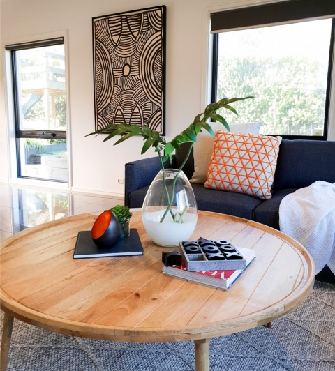
There is something about colour that oozes personality, whether it be rich, velvet, moody blues teamed with brass tones or teal paired with millennial pink: colour tells a story. It reveals the mood and personality of the owners. It shows confidence, energy and character. Colour is the great equaliser because it becomes less about what is in fashion and more about what speaks to your soul. The true designer knows how to use colour, either as standout feature or a subtle undertone. The room itself becomes a canvas where the artist is surrounding themselves with tones and hues to reveal the true character.
Not only does it take a great deal of confidence to be able to pull off a room like this, it also takes a general understanding of balance and how colours work. Sounds confusing? Well here are some basic rules to follow when using colour.
Use the colour wheel:
Even top designers will still refer to the colour wheel when considering room schemes.
The colour wheel is a great tool for understanding how colours relate to each other and how to property place different colours in a space together.
Here is an example of three common rules that can be understood better from using the colour wheel;

Monochromatic: One colour, but in various shades or hues used together. This is generally considered a relaxed, smooth or even muted colour scheme.
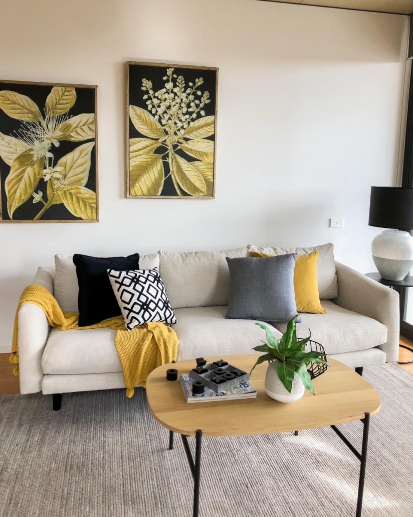
Complimentary: These are colours that are found on the opposite side of the colour wheel. When used together, complimentary colours appear brighter and stand out more.
Triadic: Three colours that are equally spaced around the colour wheel. This is where the 60:30:10 rule and colour wheel work well together.
Follow the 60:30:10 rule
The 60:30:10 rule is a basic guide for how to create balance when using colour.
60% of the room is the main colour, usually the wall colour., 30% represents the colours used in large furnishings such as the curtains, furniture or rugs. The last 10% is for the accent colours such as the cushions, art works and décor items. The 60:30:10 Rule is great if are just getting used to the idea of introducing colours to your home. You can stay safe by having the 60% wall colour in a muted soft tone, then aim for a bit more strength or definition in the 30% and go wild with the last 10% – here you can have fun and choose colours that you are attracted to and love.


Consider the room you are styling:
It is important to understand that colour can affect the mood of the room you are styling. Understanding the use of the room and the type of house you have is an important consideration when selecting the right colours.
If you are styling a bedroom, choosing colours that have a relaxed and calm response work best. Cool colours, such as blues, greens and violets, remind us of nature and so tend to have soft, calming effect. While warm colours such as reds, yellow and oranges give off a feeling of warmth and energy, and as such are more suited to entertaining areas such as the dining and living rooms.
Colour can also be greatly affected by natural light, so choosing the right colour for your house will also depend on the amount of natural light you have in a room. As much as I love olive and burnt terracotta’s; I find that the 70’s-built home I live in, simply does not have enough natural light for these colours to work. Instead I have had to add plumbs and greens against the orange clinker bricks to have any sort of impact. What works in the store may not work in the house, so be prepared to experiment with colours outside of your natural preference.
Find inspiration:
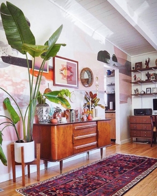
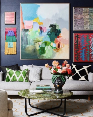
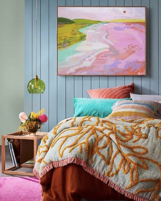
After enjoying the last few years of neutral tones you may need some additional inspiration to see how to create balance with colour. Here is a list of some of my favourite Instagram pages that feature colour, layers, art and most importantly; personality.
I am in awe of the insane ability the designers on these sites have. These are some of the talented people who understand how colour, pattern and layering work. I find myself constantly amazed at the brave and unusual combinations of colours they come up with. They seem to be breaking all the rules, and yet, each room is balanced, coordinated and perfectly put together.
Keep it personal:
Colour is about having fun and showing off your personality. Go with what you’re attracted to and have fun with it.
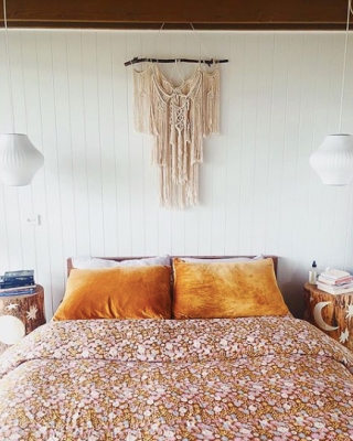
My favourite houses are the one that accurately reflect the personalities of the people living in the home. The quirky mementoes collected while travelling, a display of family photos or the handmade gift that only a mother can love. These treasured items are part of the essence of your home and can be the basis for creating a balanced and beautiful interior. Sometimes we have the right elements already in our homes, we just need the confidence to bring it out and pull it together.
Realising your own design style can be difficult but I find that if you collect items that you are genuinely attracted to, then your own style will start to reveal itself over time.

 Get your home spring ready!